
Here’s Nolan Darilek on making sure LiveBeats—or any web app—has a solid, accessible foundation to build on. If your app is already solid, deploy it in minutes on Fly.io’s global server network.
Hey, everyone. Last time we talked a bit about what accessibility is, why it’s important, and how you can incorporate it into your process. Today, using the time-travel superpowers of Git, I’ll take you along as I start making LiveBeats more accessible for screen reader users.
LiveBeats is a reference Phoenix LiveView app with real-time social features. We’d be reckless not to make sure all the parts are in good working order before real-time updates start moving them around on us. Let’s set our time machines to LiveBeats commit fad3706—or mid-November. Thanksgiving is on the horizon, winter is coming, and I’m starting to dig into this little app called LiveBeats (cue dreamlike harp glissandos)…
Low-hanging fruit
Sometimes, setting out to make an app accessible feels like surveying fog-shrouded terrain. Is that supposed to be a button? What’s all that clutter over there? Fortunately, we can clear away a lot of the murk with some easy early wins.
Labels are a great way to give some definition to the landscape. You’ve got a few tools to help with this, each of which has its own use cases:
- The faithful
altattribute is essential for images that have meaning, whether they’re beautiful photos or actionable controls. - Embedded SVGs are a separate beast entirely. An SVG image doesn’t use
altat all, but instead has a<desc/>child tag. Also, since SVGs are their own unique element, there’s a lot you can do with child tags and attributes to make these more accessible. - For elements that aren’t images, and for which there is no easy way to add text, the
aria-labelattribute adds a label that is only visible to assistive technologies.
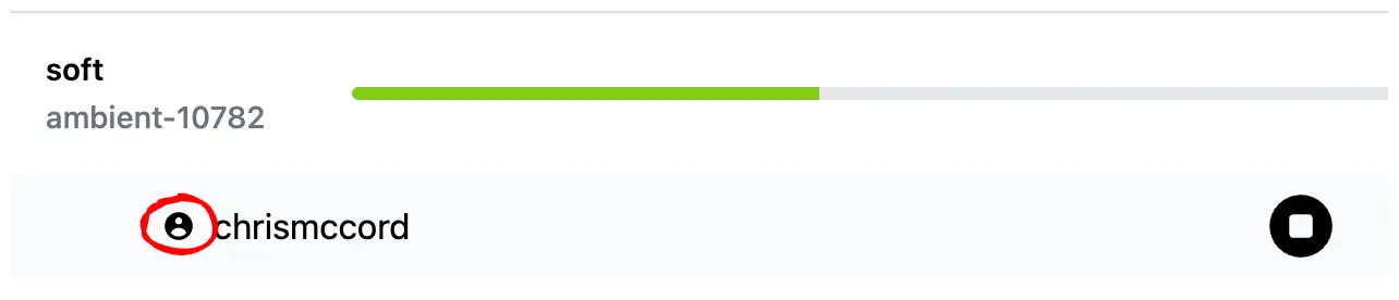
So, back to fad3706. We use aria-label here to add accessible labels to controls; for example, this button that skips to the previous track in the playlist:
<button type="button" class="sm:block xl:block mx-auto scale-75" phx-click={js_prev(@own_profile?)} aria-label="Previous">
Because this is all in a HEEx template, our aria-label can be conditional, e.g. aria-label={if @playing do "Pause" else "Play" end}
Ideally, you’d just add text as a child of the button, particularly since users with cognitive disabilities may struggle with what a given icon means. If you’re using an image for your button, add an alt attribute. Where neither is the case, aria-label is the ticket.
Labeling meaningful elements is only part of the story, however. Hiding irrelevant images can be just as important. If my screen reader presents a thing, then it should be relevant to me. Decorations and placeholders usually aren’t, and should be hidden, either by applying aria-hidden="true" to the element, or by adding a blank alt attribute to images.
You can see an example of hiding icons in f7db67f:
<span class="mt-1"><.icon name={:user_circle} aria-hidden="true"/></span>
Hiding a decorative icon saves my screen reader from reading what appears to be an empty element. It’s a small thing, but half a dozen small things add up.
Role with it, but not too far
We’ve labeled some things and hidden others. The fog is burning away, and we have a slightly clearer view of the land around us. It’s now time to fill in the details.
Roles are powerful tools that make one thing appear to be another. Say you have a <div/> tag that needs to work as a button. You can make it seem like a button like so:
<div role="button">No really, click me!</div>
Unfortunately, the above is the equivalent of slapping on a fake mustache and glasses. To my screen reader, it now looks like a button. But the role alone doesn’t make it act like a button; it doesn’t focus when I tab, and doesn’t click when I press Space or Enter.
It’s better to use a <button/> and get this button behavior built in. But if you can’t, or if you’re building a widget like a dropdown menu or tree, roles are crucial.
Roles are great for signposting semantic regions on pages. Here are the most important:
role="navigation": Use this, or a<nav/>element, for application menus.role="main": Use this, or the<main/>element, for the main area of your page. There should only be onemainelement or role per page.role="article": Use this, or the<article/>element, for self-contained page elements representing posts in a blog or forum.
All of the above roles have semantic HTML equivalents. This isn’t universally true—there isn’t a semantic HTML equivalent of a tree control, for instance—but you should prefer HTML where possible.
There’s a lot to unpack there. But as an example, commit 5cf58b2 combines some of what we’ve discussed to achieve more intuitive navigation within LiveBeats.
We use the <main> element to surround the page content that changes when new routes are visited. Using role="main" would serve the same purpose, though less elegantly.
Then, we use another technique to associate names with areas of the page:
    <!-- player -->
    ...
    <div id="audio-player" phx-hook="AudioPlayer" class="w-full" role="region" aria-label="Player" >
      <div phx-update="ignore">
        <audio></audio>
      </div>
    </div>
This last snippet does a couple of things. Adding a new region landmark to the page with role="region" gives us easier navigation into and out of it, via hotkey. In NVDA, I can jump between this and other interesting regions of the page by pressing d. Then, the aria-label attribute ties the label “Player” with that region, such that navigating into or out of the player explicitly announces the focus entering or leaving the player.
If you find yourself writing documentation with phrases like “In the player, click Pause” or “Find this in the messages section of the dashboard,” named regions help make those instructions more relevant to screen reader users. Styling may make the player region visually obvious, but the region role and “Player” label makes it very apparent when the caret enters the audio player.
Roles are powerful in large part because they’re promises. If you promise your user that a thing is a button, then it needs a tabindex for keyboard focus, as well as handlers to activate it when Enter or Space is pressed. If you’re curious about what these promises are, the WAI-ARIA Authoring Practices document is an exhaustive source of all commonly expected keyboard behaviors for a bunch of widget types. Want to know how a list box should behave when arrowing down past the last element? This resource has you covered.
That said, it is very possible to overuse roles in your application. Here are two examples of role misuse I often find in the wild.
Menus aren’t what you think
role="menu" is not intended for every list of links in your app that might possibly be a menu if you tilt your head and the sunlight lands just so. These are either application menus like you’d find in a menu bar, or standalone dropdown menus that capture keyboard focus and expand when you click on them. Misusing role="menu" won’t necessarily make a given control unusable, but it does cause confusion by presenting an element as something it isn’t.
Fly.io is not just for Elixir/Phoenix/LiveView!
Any app that benefits from low-latency connections to users worldwide will love Fly.io.
Try Fly.io for free →
This one weird trick makes your entire app inaccessible in 30 seconds!
This one gets its own section because it’s that bad. If you want your app to be so inaccessible that most screen reader users turn away in the first few seconds, slap role="application" on one of the top-level elements. Explaining just why this is takes a bit of effort, so please bear with me.
Broadly speaking, screen reader users browse the web in one of two modes. Caret browsing mode presents pages as if they’re documents. We can arrow through their contents line by line or character by character, select and copy text, etc. You can experience a limited version of this by pressing F7 in most browsers, though screen readers enable this mode by default. They also add conveniences like jumping between headings with h, buttons with b, landmarks with d, etc.
Focus mode, sometimes called “forms mode,” because it enables automatically when form fields are highlighted, passes keys directly through to the application. This is generally what you want when typing into forms, or when using keyboard commands that you don’t want filtered out by caret browsing. Incidentally, focus mode is closest to how native applications behave; you don’t normally read application screens as if they were documents, or jump between controls by element type.
That, more or less, is what role="application" enforces. It enables focus mode by default, meaning your screen reader users can’t explore via caret browsing and its associated commands. It also changes the way the site presents itself to screen reader users, such that it appears to be a native app, and not a web document with a built-in interaction model. It’s a promise that you’ll supply it all; you’ve gone through the extraordinary effort to ensure all your controls are focusable, they all have sensible keyboard behaviors, and that your users won’t be struggling to read text that changes.
You might feel you have to use role="application" just because, well, you’re making an application. But this is often not the right choice. If you’ve ever been annoyed by an Electron app’s non-native behavior, multiply that by about 11 and you’re in the ballpark of how frustrating role="application" can be when it’s not backed up by thorough and consistent handling of every interaction. While I’ve got this podium: Slack, you’re one of the biggest perpetrators of this, and need to cut it out. Most of my usability issues with Slack spring from its use of role="application" everywhere, with haphazard and nonstandard workarounds in place to patch in what HTML provides for free.
Closing thoughts
While this post has been light on the real-time aspects of LiveBeats, harvesting this low-hanging fruit is an important step to making any web app accessible. We certainly don’t want it in the way next time, when we’ll start going live, exploring the challenges and methods to accessibly presenting changes as they roll in over the wire. Meanwhile, if you have questions or topics you’d like covered, drop a line here and I’ll try to work them in. Thanks for reading!