
This is a post about making a Tailwind styled tabs component play nicely on mobile without using Alpine.js or other client-side frameworks. If you want to deploy your Phoenix LiveView app right now, then check out how to get started. You could be up and running in minutes.
This recipe creates a Tailwind UI styled tab component that gracefully switches to an HTML select input when viewed on smaller screens. It doesn’t use Alpine.js or other client-side javascript frameworks for managing the UI. It is built as a client-side, reusable, LiveView component.
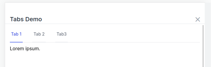
The finished component works and looks like this:
Why is this tricky?
The trick bit is that tab titles can be long. When displayed on a narrow mobile device, it can look ugly. Tailwind UI styled tabs solve this by using browser media queries to dynamically switch to an HTML select input. The extra tricky bit comes when rotating a device from wide to narrow and the currently selected tab needs to now show the appropriate active select option. So the HTML select and the tabs need to be kept in selection sync even when hidden.
Well, we’re going to figure how to build tabs that are mobile friendly in this way and work entirely client-side in the browser.
The template code to create this component looks like this.
<.tab_list id="my-tabs">
  <:tab title="Tab 1" current>
    <p class="mt-2">Lorem ipsum.</p>
  </:tab>

  <:tab title="Tab 2">
    <p class="mt-2">Lorem 2 ipsum.</p>
  </:tab>

  <:tab title="Tab3">
    <p class="mt-2">Lorem 3 ipsum.</p>
  </:tab>
</.tab_list>
If this interests you, read on!
Backing up to answer the “Why?”
Why do it this way? Why do it without a client-side JS solution like Alpine.js? Let’s talk through the thought process that brought us here.
phx-click Approach
The first pass solution at a tabs component used phx-click attributes to notify the server that a tab selection changed. This worked well and was really easy.
Problems:
- Didn’t work well for the mobile-friendly
selectinput. Keeping them in sync means going through the server. - Click events require talking to the server.
The real problem here is that the server doesn’t need to be involved with this UI-only change.
Can we change tabs without involving the server?
Alpine.js Approach
There really was no reason to involve the server for changing active tabs. For this use case, it really should remain a client-side only feature.
The PETAL stack uses Alpine.js for client-side Javascript interactions. Here’s a list of the different parts of PETAL:
This means the default tool to reach for here is Alpine.js. If you’ve ever inspected the Tailwind UI components in the browser, they are implemented using Alpine.js. That’s another check in the Alpine column!
But I don’t want to use Alpine.js. It’s nothing against Alpine.js! It’s a great framework. Using Alpine.js adds a JS dependency to any project wanting to use this tabs component. This means it’s less portable between all my great unicorn app projects.
Can we add the client-side tabs without using Alpine.js?
Hooks Approach
Phoenix LiveView has a feature called client hooks. This is probably the way we should do it. It offers the most power and versatility.
Why not do it this way?
A major benefit to me of the PETAL stack is “co-location”.
With a LiveView component, the HTML markup and rendering logic are all in one place. Additionally, the styles are in the markup (Tailwind CSS) and any custom JS can be included in the HTML using Alpine.js.
We get nifty benefits from “co-location”. Everything is one place. The benefit is a mental one mostly. It’s the benefit of not needing to jump between multiple CSS files, template markup, a separate code file and then separate JS file(s).
Co-location brings a simplification and organizational benefit. It keeps my brain from melting down holding all that in addition to the problem I’m trying to solve.
The reason not to use the hook approach here is because I want to see if I can keep the benefits of co-location without using Alpine.js for the JS part.
Can we get the JS behavior we want without using hooks?
JS Commands Approach
LiveView’s JS commands are a recent addition (v0.17+). They provide commands for executing JavaScript utility operations on the client.
This is where Berenice’s excellent post Client-Side Tabs in LiveView With JS Commands came in. It was a great all-client-side solution using JS commands! Boom! Done!
Problem:
- It didn’t include the
selectmobile behavior. That’s a major goal for this particular component.
That shouldn’t be hard to add, right?
Ahem.
That’s where this post comes in. With help, we got it solved. We’ll cover what was learned along the way and suggest possible improvements.
Problem being solved
Let’s clearly define the problem so we know when it’s solved.
How do I create a Tailwind UI styled tab component that switches to an HTML select input for mobile formats using only LiveView?
Constraints:
- Don’t involve the server for something that is client-only UI.
- Avoid adding a Javascript dependency like Alpine.js.
- Don’t use hooks in order to keep co-location benefits.
- Do it using only LiveView provided features.
So how do we actually do that?
Solution
NOTE: This builds on Berenice’s excellent post Client-Side Tabs in LiveView With JS Commands.
There are two parts to the solution. The LiveView component code and 4 lines of extra javascript (which comes in later).
The following Elixir code defines a stateless function component for our tabs. It supports a slot named tab for defining a tab’s content. We’ll talk a bit more about it after the code. You’ll also notice the private function show_tab that builds the JS commands for activating a tab.
defmodule Web.Components do
  import Phoenix.LiveView, only: [assign: 3, assign_new: 3], warn: false
  import Phoenix.LiveView.Helpers
  alias Phoenix.LiveView.JS

  def tab_list(assigns) do
    assigns =
      assigns
      |> assign_new(:active_class, fn -> "border-indigo-500 text-indigo-600" end)
      |> assign_new(:inactive_class, fn -> "border-transparent text-gray-500 hover:text-gray-700 hover:border-gray-300" end)
      |> assign_new(:class, fn -> "" end)
      |> assign_new(:tab, fn -> [] end)

    ~H"""
    <div id={@id} class={@class}>
      <div class="sm:hidden">
        <label for={"#{@id}-mobile"} class="sr-only">Select a tab</label>
        <select
          id={"#{@id}-mobile"}
          name="tabs"
          phx-change={JS.dispatch("js:tab-selected", detail: %{id: "#{@id}-mobile"})}
          class="block w-full pl-3 pr-10 py-2 text-base border-gray-300 focus:outline-none focus:ring-indigo-500 focus:border-indigo-500 sm:text-sm rounded-md"
        >
          <%= for {tab, i} <- Enum.with_index(@tab) do %>
            <option value={"#{@id}-#{i}"}><%= tab.title %></option>
          <% end %>
        </select>
      </div>
      <div class="hidden sm:block">
        <div class="border-b border-gray-200">
          <nav class="-mb-px flex space-x-8" aria-label="Tabs">
            <%= for {tab, i} <- Enum.with_index(@tab), tab_id = "#{@id}-#{i}" do %>
              <%= if tab[:current] do %>
                <.link id={tab_id} phx-click={show_tab(@id, i, @active_class, @inactive_class)} class={"group inline-flex items-center py-4 px-1 border-b-2 font-medium text-sm #{@active_class}"} aria-current="page"> <%= tab.title %> </.link>
              <% else %>
                <.link id={tab_id} phx-click={show_tab(@id, i, @active_class, @inactive_class)} class={"group inline-flex items-center py-4 px-1 border-b-2 font-medium text-sm #{@inactive_class}"}> <%= tab.title %> </.link>
              <% end %>
            <% end %>
          </nav>
        </div>
      </div>
      <%= for {tab, i} <- Enum.with_index(@tab) do %>
        <div id={"#{@id}-#{i}-content"} class={if !tab[:current], do: "hidden"} data-tab-content><%= render_slot(tab) %></div>
      <% end %>
    </div>
    """
  end

  defp show_tab(js \\ %JS{}, id, tab_index, active_class, inactive_class) do
    tab_id = "#{id}-#{tab_index}"

    js
    |> JS.add_class("hidden", to: "##{id} [data-tab-content]")
    |> JS.remove_class("hidden", to: "##{tab_id}-content")
    |> JS.remove_class(active_class, to: "##{id} nav a")
    |> JS.add_class(inactive_class, to: "##{id} nav a")
    |> JS.remove_class(inactive_class, to: "##{tab_id}")
    |> JS.add_class(active_class, to: "##{tab_id}")
    |> JS.remove_attribute("selected", to: "##{id}-mobile option")
    |> JS.set_attribute({"selected", ""}, to: "##{id}-mobile option[value='#{tab_id}'")
  end
end
What is show_tab doing?
The show_tab function creates a series of JS commands that are linked to the phx-click events of the tab links.
The commands take the approach of applying a blanket change to a group of DOM elements before making a more specific change to display the active selection. It also updates the HTML <select> input even when it’s not visible.
What’s going on with that for comprehension?
This nifty bit of code in the template is worth closer examination. Here’s a greatly simplified version of it:
for {tab, i} <- Enum.with_index(@tab), tab_id = "#{@id}-#{i}" do
  <.link id={tab_id} <%= tab.title %> </.link>
end
First, the Enum.with_index/2 function is given a list of tabs. It returns a list of tuples shaped like {tab, index}. That’s pretty cool on it’s own. Within a for comprehension it lets us iterate the list while also getting an incrementing index. It becomes similar to a regular for loop in non-functional languages.
The part that makes this look confusing is the extra comma and tab_id = "#{@id}-#{i}". What’s that all about?
This is where we are reminded that an Elixir for comprehension is not a for loop. A for comprehension can include additional generators or filter functions. Our usage here is like a filter that always returns truthy (so nothing is filtered out), but we can use it to assign a variable with each iteration.
Here’s some IEx friendly code to try out and play with it yourself.
tabs = ["tab-1", "tab-2", "tab-3"]

for {tab, i} <- Enum.with_index(tabs), tab_id = "#{tab}-#{i}" do
  IO.inspect tab, label: "TAB"
  IO.inspect i, label: "INDEX"
  IO.inspect tab_id, label: "TAB_ID"
end
When run in IEx, the results look like this:
TAB: "tab-1"
INDEX: 0
TAB_ID: "tab-1-0"
TAB: "tab-2"
INDEX: 1
TAB_ID: "tab-2-1"
TAB: "tab-3"
INDEX: 2
TAB_ID: "tab-3-2"
This trick is handy in templates because it’s easy to define variables in our loop. The alternative you see often in other languages is frowned upon in LiveView because it’s harder to detect when HEEx template chunks have changed.
<%= for {tab, i} <- Enum.with_index(@tab) do %>
  <% tab_id = "#{@id}-#{i}" %>
  Don't do it this way!
<% end %>
So now you know better and won’t do it that way. 🙂
Not quite there yet!
Just using this code, it works great for non-mobile interfaces. The problem is when it switches to the select input. Changing the selection using the dropdown doesn’t activate and show the selected tab contents!
Here’s how our solution looks to this point:
When we change the <select> dropdown, no matter what selection we make, it doesn’t change the displayed tab contents.
We’re soooo close!
This extra, 4 lines of Javascript bridges that chasm for us. This can live in our app.js file.
// Tabs behavior
window.addEventListener("js:tab-selected", ({detail}) => {
  let select = document.getElementById(detail.id)
  let link = document.getElementById(select.value)
  liveSocket.execJS(link, link.getAttribute("phx-click"))
})
What does this do? The select input has the following phx-click event.
phx-change={JS.dispatch("js:tab-selected", detail: %{id: "#{@id}-mobile"})}
When the select changes, it dispatches a local (stays in the browser) event called "js:tab-selected". It passes along the details which is the ID of the select input.
The Javascript adds an event listener that is called by the click event. If finds the select input and the tab link with the same value as our selected option. This links our selection from the list to our tab. It then executes the JS commands defined in the phx-click for the tab.
An alternative version of the Javascript triggers a “click” on the element rather than execute the JS commands. That looks like this:
// Tabs behavior
window.addEventListener("js:tab-selected", ({ detail }) => {
  let select = document.getElementById(detail.id)
  let link = document.getElementById(select.value)
  if (link) { link.click() }
})
The last line of code says, “If we found the link, ‘click’ it.” The execJS is a better general solution for running commands that might not be clickable.
Nice! Either approach bridges the selected option to our tab.
This little bit of extra JS isn’t ideal because we were trying to co-locate everything. Still, with this little bit of Javascript, we’re there! We have a Tailwind UI styled tab component that falls back to a <select> input on narrower mobile screens!
Behold it in all its glory!
What was learned?
Stretching to reach an ideal, even when we don’t fully reach it, helps us better see both where we fall short but also to realize what we are able to do. With this exercise, we saw what we can do without Alpine.js. We also found ways that LiveView can improve.
There were some challenges to getting this working. In fact, I got some help from a colleague. Thanks Chris McCord! 🙂
- A big challenged was solved with the 4 lines of JS that makes our select input execute the JS commands.
- We learned that currently, we can’t fully realize the dream of fully co-located JS logic without Alpine.js. Particularly when conditional JS logic is needed.
- Hooks may be the “blessed” way to do the Javascript portion. If the DOM were expressed in a hook, it might be more clear about what’s happening. However, in this case, it wasn’t too bad.
- There were some more things learned along this journey that I’ll save for a follow-up post.
Closing this out, I am satisfied with how portable it ended up. As an experiment in creating a component with client-side behavior that keeps most of the benefits of co-location, I learned a lot. Hopefully you learned something helpful too!
Phoenix Apps Run Great on Fly
Fly is an awesome place to run your Elixir apps. Deploying, clustering, connecting Observer, and more are supported and even fun!
Deploy your Elixir app today! →
Credits
Special thanks to:
- Berenice Medel for her previous work on tabs that got me quite far.
- Chris McCord for improving my component API and writing those critical 4 lines of JS.